Overview
In today's business world, huge amounts of data are generated. Can you imagine being able to transform your sales data into valuable insights at a glance? With Aitana Sales BI this is a reality. It is an intuitive and powerful tool that will enable you to make more informed and strategic decisions, putting you one step ahead of the competition.
Aitana Sales BI is the perfect solution to optimize your sales management. You will be able to visualize your data, identify trends, and uncover hidden opportunities that will drive your business growth, analyze the performance of your sales team, identify the most profitable products, and better understand your customers with just a few clicks. All this is possible thanks to seamless integration with Business Central, ensuring that your data is always up-to-date and ready for analysis.
Aitana Sales BI automates the reporting process. This efficiency not only saves time, but also minimizes the risk of human error, ensuring that you always have access to reliable data.
Analyze your Sales
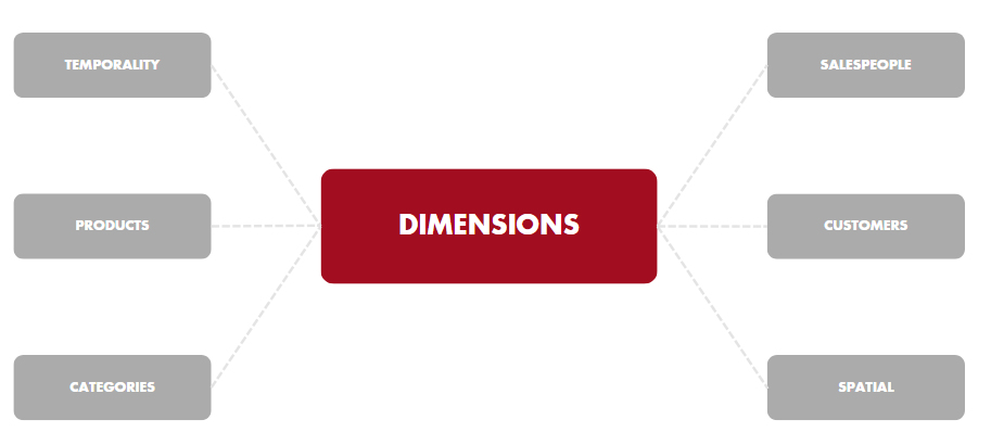
First of all, Aitana Sales BI obtains the list of the different companies that are in the Business Central environment selected during the installation. From these companies all the information of their sales will be obtained, as well as the different dimensions that describe each one of the transactions.
The dimensions with which Aitana Sales BI works are:
Hundreds of measures, metrics, KPI's and graphics have been built from sales and all the dimensions that allow the user to analyze the performance of their business. In addition to the fundamental measures, some to highlight are:
- Sales summary
- Sales structure
- Pareto KPI's
- ABC classification of products
- ABC classification of customers
- Rankings
- Customer portfolio analysis
- Product categorization
- Temporal variations
- Product analysis
- Salespeople evolution
- Customer analysis
- Geographical analysis
General Sales Analysis
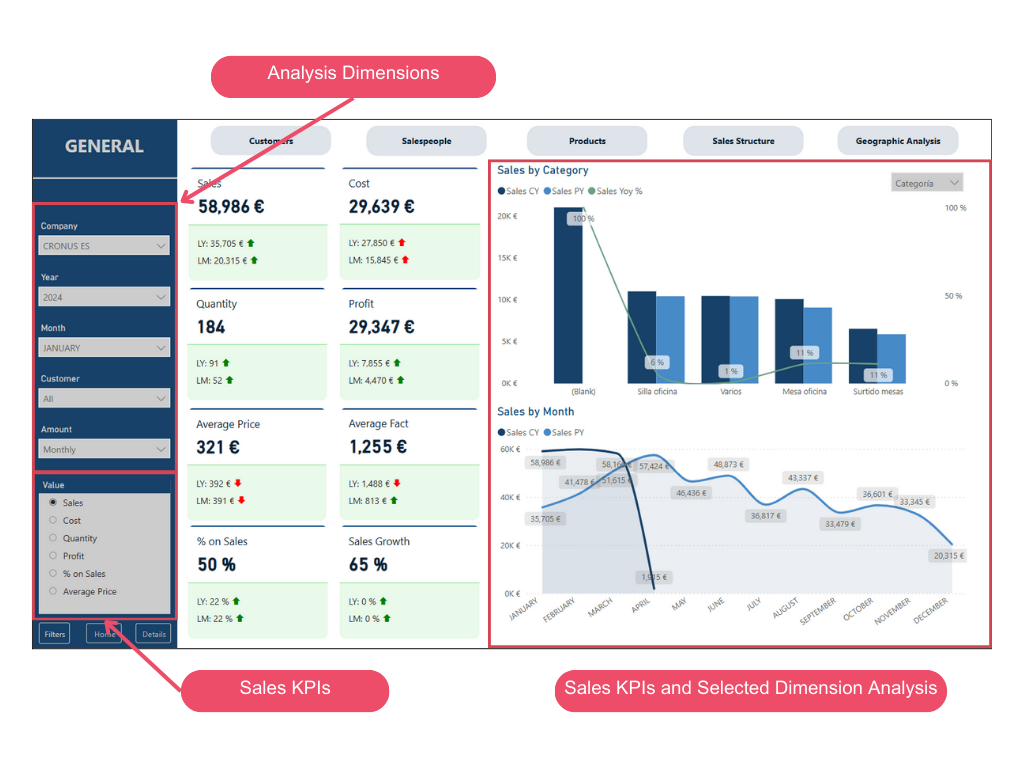
General Analysis
This page allows users to analyze different KPIs related to sales across various dimensions, such as companies, year, month, customer, or amount type. Users can select both the KPI they wish to analyze and the dimension they want to cross-reference.
In this case, users can analyze sales by category, quantity by product, cost by month, and more, while also obtaining a comparison with the previous year.
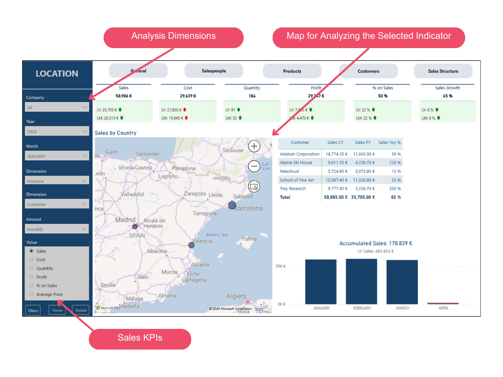
Geographic Analysis
With Sales BI, users can also analyze sales, costs, quantities sold, profit, average price, and percentage of sales by region.
This page also allows users to understand the annual variation percentage for a specific KPI and identify the regions with the highest values for each indicator.
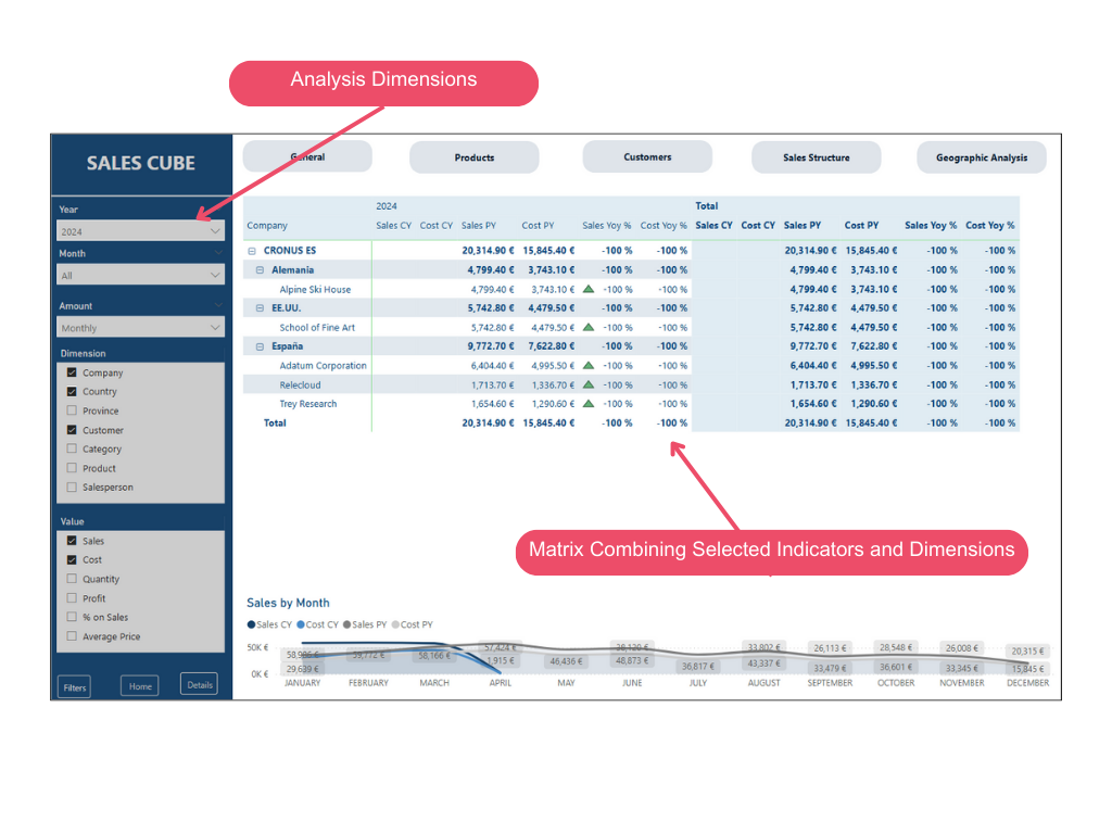
Sales Cube
Sales cube enables users to cross-reference different indicators and dimensions in a table, allowing them to analyze the annual value of each metric along with its variation from the previous year.
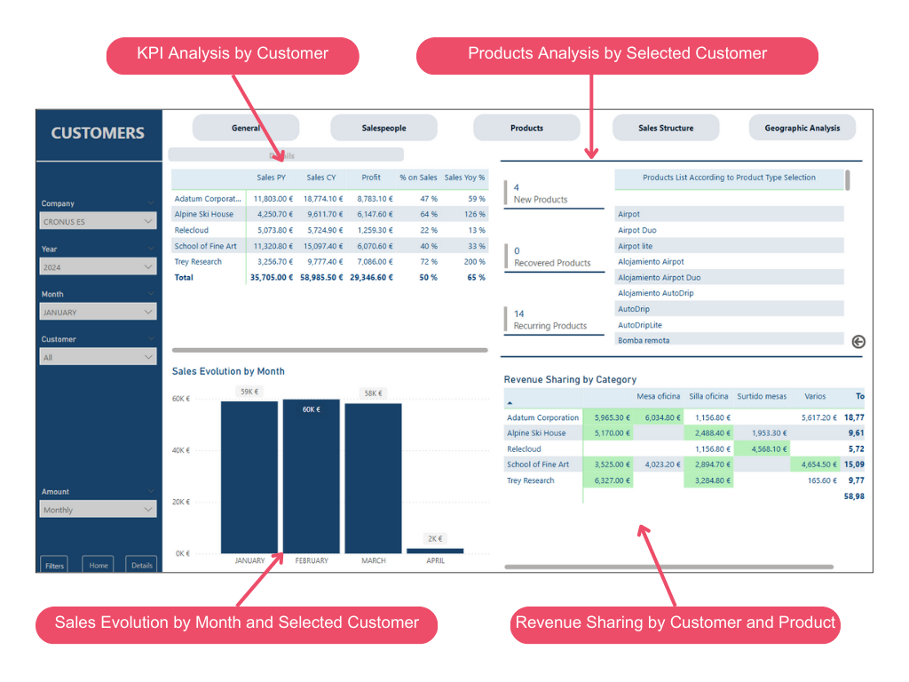
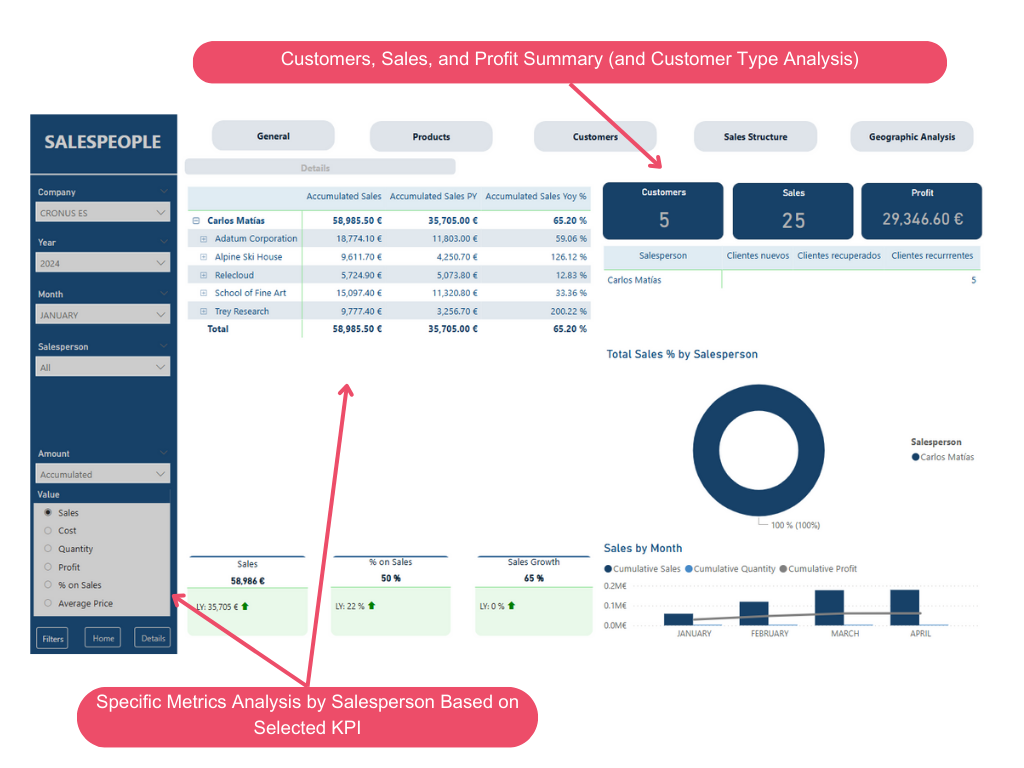
Detailed Customer Analysis
Customer analysis allows users to analyze the customer portfolio and obtain specific information about each customer.
Customer Portfolio
Users can analyze key metrics for individual customers and the portfolio as a whole, as well as the monthly sales evolution for the selected customer and the revenue distribution by product category and customer.
Additionally, users can identify new, recovered, and recurring products for each selected customer.
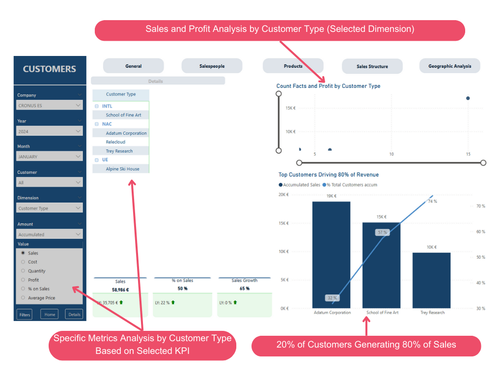
Customer Analysis
This analysis enables users to understand the number of sales and profits for each type of customer, as well as identify the customers who generate 80% of the total revenue.
This allows users to identify and analyze the behavior of customers who generate the majority of sales, following the Pareto principle (80/20), where 20% of customers typically generate 80% of sales.
Detailed Product Analysis
This analysis is divided into two pages: Product Portfolio and Product Analysis.
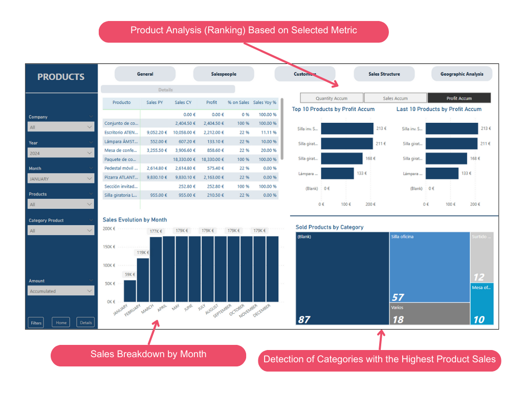
Product Portfolio
Similar to the customer portfolio analysis, users can understand the monthly sales evolution by selected product/product category, as well as the number of products sold by category, highlighting categories with the highest sales.
In addition to the breakdown of KPIs by product, users can also identify the ranking of products with the highest accumulated profits, most units sold, or highest accumulated sales. This allows for the analysis of the top 10 products in the ranking and the last 10.
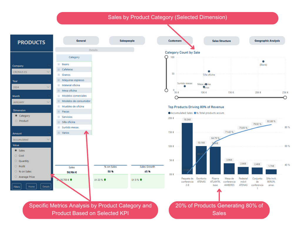
Product Analysis
This page allows users to analyze metrics by product, as well as sales by product category.
Similar to the product analysis, users can identify and analyze the products that generate the majority of sales, following the Pareto principle (80/20), where 20% of products typically generate 80% of sales.
Salesperson Analysis
Similar to the product and customer analysis, a salesperson analysis is also conducted.
This analysis allows users to understand, for each salesperson, the customers they have sold to and the products sold, as well as the profit generated and the percentage of total sales represented by each salesperson. Additionally, it includes a classification of the total customers for each salesperson, allowing users to identify how many customers are new, recovered, and recurring (as defined in the Power BI connector).
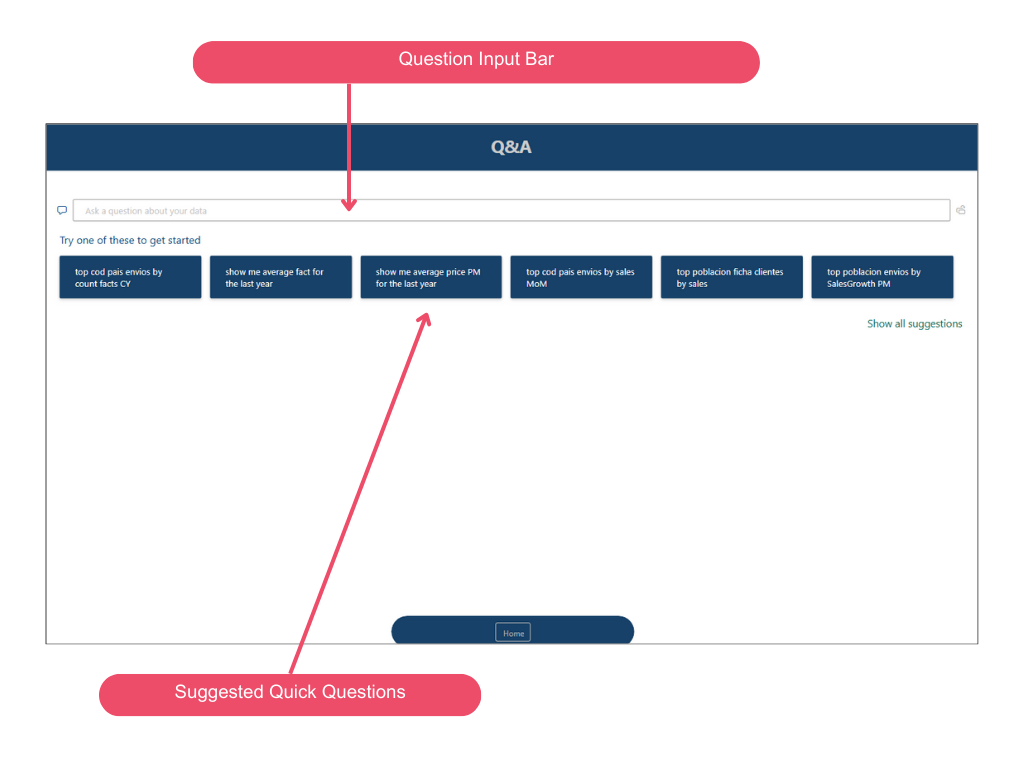
Analysis with AI Visuals
Q&A
Sales BI incorporates various AI visuals. Firstly, it includes Q&A, allowing users to ask questions to obtain specific data quickly. For example, users can quickly find out:
- Customers in May 2023
- Average invoice amount in 2024
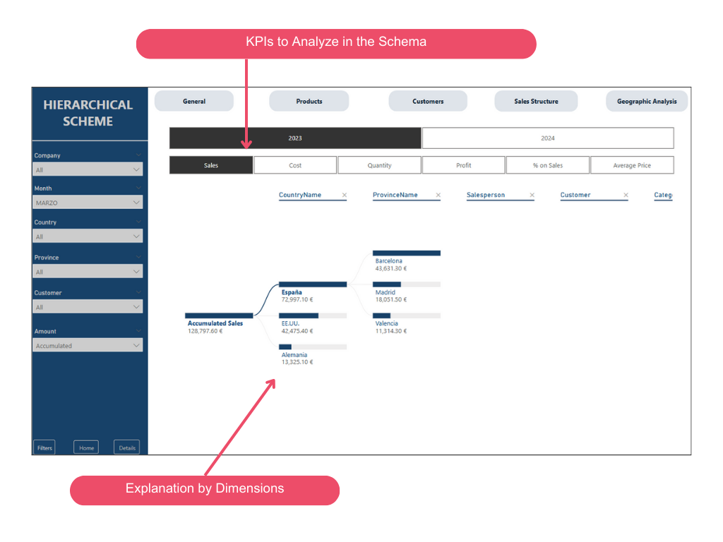
Hierarchical Scheme
The hierarchical scheme visual in Power BI allows users to visualize data across multiple dimensions. It automatically aggregates data and enables in-depth exploration of dimensions in any order. As an AI visualization, users can request the next dimension to explore based on certain criteria.
This makes it a valuable tool for ad hoc exploration and root cause analysis. Users can use "AI Splits" to identify which part of the data to focus on next. These splits appear at the top of the list and are marked with a lightbulb. The splits help users automatically search for high and low values in the data.
The analysis can function in two ways according to user preferences. The default behavior is as follows:
High Value: Considers all available fields and determines which one should be explored in-depth to obtain the highest value of the measure being analyzed.
Low Value: Considers all available fields and determines which one should be explored in-depth to obtain the lowest value of the measure being analyzed.
In this particular case, sales KPIs that appear on all pages can be analyzed based on dimensions such as country, province, customer, etc.
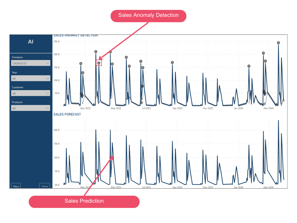
Anomaly Detection
This feature uses advanced algorithms to detect anomalous patterns, specifically combining two powerful algorithms: Spectral Residual (SR) and Convolutional Neural Networks (CNN).
The Spectral Residual model is commonly used in the visual domain for anomaly detection applications. It is an efficient unsupervised algorithm that demonstrates exceptional performance and robustness in visual saliency detection tasks.
Spectral Residual consists of three main steps:
- Fourier transformation to obtain the logarithmic amplitude spectrum.
- Calculation of the spectral residual.
- Inverse Fourier transformation to convert the sequence back to the spatial domain.
Next, the CNN is trained using automatically generated anomalies, significantly improving performance compared to the original SR model. Since the anomalies used for CNN training are entirely synthetic, the SR-CNN approach remains unsupervised and sets a new state-of-the-art performance when manually labeled data is unavailable.
This functionality helps enhance line charts by automatically detecting anomalies in time series data. It also provides explanations for anomalies to assist with root cause analysis. With just a few clicks, users can easily find insights without segmenting or analyzing the data.
In this case, it is configured with Sensitivity at 70%. (The higher the %, the fewer anomalies it will detect). By clicking on each marked anomaly in the chart provides an explanation in a pop-up window.
Sales Predictions
This feature uses Exponential Smoothing to make time series predictions.
It is a forecasting method for time series data used to predict future values based on historical data. This approach assigns exponentially decreasing weights to past data, so more recent values have a greater impact on the prediction than older ones. This makes it particularly useful for time series where recent data is more relevant.
Sales predictions can be made for 30 days into the future with a confidence interval set at 95%, meaning that 95% of the time, the predicted value will fall within the provided intervals.
The gray shadow accompanying the prediction (gray line) represents the confidence interval.
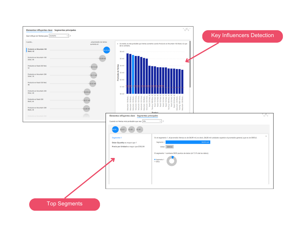
Key Influencers
The key influencer visual is an excellent choice if you want to:
- See which factors affect the metric being analyzed.
- Compare the relative importance of these factors.
Key elements include:
Tabs: Select a tab to switch between views. The Key Influencers option shows the main factors contributing to the value of the selected metric. The Top Segments option shows the top segments contributing to the value of the selected metric. A segment is a combination of values. For example, a segment could be long-term customers living in the western region.
Dropdown Box: The value of the metric being investigated. This shows how to explain the increase in sales.
Reinterpretation: Helps interpret the visual in the left panel. E.g., When the Product is X, the average sales increase by X€.
Left Panel: The left panel contains a visual. In this case, it shows a list of the main key influencers (products).
Right Panel: The right panel contains a visual.
Average Line: The average is calculated for all other possible values of Theme, except ease of use (the selected influencer). Therefore, the calculation applies to all black values. It indicates what percentage of other Themes had a low rating. In this case, 11.35% had a low rating (shown by the dotted line).
Checkbox: Filters the visual in the right panel to show only the values that are influencers for that field.
Try Aitana Sales BI!